Ascending From Fast Food
Today on my blog, I wanted to speak on behalf of our love for commercial interiors! Our business is made up of roughly half commercial interiors and half residential interiors. Did you know commercial design was my first love and first job right out of college? Healthcare design to be specific. One aspect of commercial design that I love, is that clients tend to be more design risk takers. They are more willing to follow trends and be open to different design concepts.
Did you know that True Design does work outside of the New Braunfels, TX market? That’s right, we are ready to tackle any project near or far (I’m talking to you Fiji Islands, wink, wink). Today I am taking you to Denver, CO to discuss a wonderful project we were lucky enough to be a part of. We had an awesome team going into this project. So let’s get down to business and into the details!
The building was an old Wendys, which will come as no shock when you see the before pictures. It is easily identifiable as such. One of the fun design challenges of the project was making the exterior of the building to be more in line with the brand of our client and not Wendys. I love projects like this. Creatively, this was a blank canvas with the challenge of making new patrons not want a burger when they saw it.
The Architect decided early on that the existing “sunroom” would need to be demolished completely. So off to the drawing board we went. We came up with three exterior design options and ultimately the client decided on a clean, modern look. I can’t tell you how happy we are with the results! Man, what a difference!
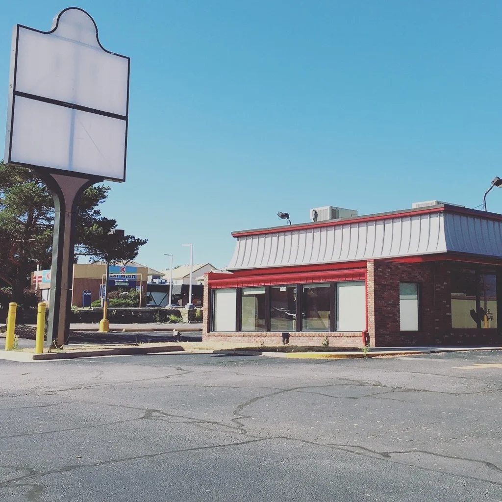
Before,“Where’s the beef?”

Exterior Rendering design.
I won’t bore you with a bunch of before interior pictures of the space because, get this, it looked like a Wendys and it actually smelt like one too. But here are a few to wet your whistle.

Yep, that’s an old Wendy’s.

Can you smell the burgers?
We worked closely with a graphic designer to tie in the brand with the interior and exterior design of the space. We understand the importance of brand experience in not just graphics, websites and packaging but also in our client’s space. Everything must be cohesive for it to work and work it does! Much of the inspiration for the space came from the logo.

Logo by my hubby Austin Buck.

Lobby area.
Within the retail area, we feature product in custom display cases with integral lighting. The custom wood trellis above the display cases acts as not only wayfinding for customers but also provides a more intimate point of sale.

This space was thoughtfully created for a better retail experience.

Additional retail space.
Brand merchandise is showcased through a custom wood and steel display. All of the wall graphics utilize photographs taken by Austin Buck at Ascend’s green house location. The photographs depict their product and their team.

Clean and modern retail space.

Tada! Burgers no more! She is a beauty.
This project really showcases True Design’s versatility. I am motived as a designer to find projects that challenge my skills and desire to create functional and beautiful spaces. I had the opportunity to work with a great team and together we created a space that is more sleek and modern than fast food.
Enjoy!